Showing posts with label color. Show all posts

Thursday, September 26, 2024

GLIDDEN PAINT BY PPG 2025 COLOR OF THE YEAR: PURPLE BASIL

PPG has announced the GLIDDEN paint by PPG 2025 Color of the Year: Purple Basil (PPG1046-7), a warm, high-impact hue that demonstrates the transformative power of color.


GLIDDEN Paint by PPG 2025 Color of the Year: Purple Basil PPG1046-7. Photo courtesy of GLIDDEN Paint, PPG

The color choice aims to empower consumers to unapologetically paint with colors that speak to them.

"So many people start their color selection journey looking at bold hues, but ultimately settle for a more expected or muted color," said Ashley McCollum, PPG color expert, Glidden brand. "This year we are encouraging these 'color chip daydreamers,' as we call them, to put aside trepidation about what the neighbors will think or potential resale value. For 2025, purple isn't just permitted, it is encouraged."

Read more: https://www.fashiontrendsetter.com/v2/2024/09/25/glidden-paint-by-ppg-2025-color-of-the-year-purple-basil/

Monday, July 2, 2018

Yves Behar's Latest Project: CANOPY Jackson Square in San Francisco

Designed by Yves Behar and Amir Mortazavi of M-PROJECTS, CANOPY Jackson Square delivers impeccable contemporary and ergonomic design within a serene, distraction-free environment


Overview
Inspired by the artists and radicals who brought to life San Francisco’s North Beach and Jackson Square neighborhoods in the 1950s, CANOPY was designed to be a profound departure from the standard workspace. 


Strong site-lines organize the 13,000-square foot space, with CANOPY’s signature glass-enclosed private offices lining one side, and a café by Jane and open workspaces on the other. 


In the center, an organic lounge is a place-making architectural tour-de-force intended to encourage both casual conversations and work meetings. A literal, dramatic architectural canopy was built around three columns as a freestanding fanning structure that doubles as book and magazine shelving. 


The tree-like design serves as both a visual privacy screen to the conference room and work areas, as well as a containment of the lounge area. An exercise in visual expression, CANOPY Jackson Square strives to create a harmonious and thoughtful balance between work and social. The space is bathed by natural light; all areas were designed to have light filtering in from multiple directions.


CANOPY was built with innovative features that encourage privacy and inhibit sound. Private offices are sealed by high-tech Modernus glass partitions and feature soft floors and ceiling surfaces, inciting quality conversations. 


Common spaces have slated ceiling insulation throughout, as well as CANOPY’s signature foam light fixtures, which provide additional sound control. Upholstered furniture, fabric desk privacy screens, and soundproofing materials that line the phone booths and Mother’s Room all uniquely contribute to a distraction-free environment.


Outdoor Work Terrace
A rare and standout feature of CANOPY Jackson Square is an innovative outdoor work terrace encompassing 1,500 square feet with breathtaking views of San Francisco and presenting a healthy and new work style enabled by technology and design. 


The expansive space is partially covered and heated for year-round, all-season use. Three zones encompass café-style seating, a casual lounge space, and workspaces for one-on-one collaboration or meetings complete with marble tables and high-quality, ergonomic, heated seating by Galanter & Jones that enable longer and more comfortable outdoor work sessions. 


An outdoor awning structure, made of recycled sails and designed to protect members from the elements, was designed by Yves and Amir in collaboration with SF-based MAFIA Bags founder, Marcos Mafia.

Palette, Products & Finishes
CANOPY Jackson Square’s color palette is a nod to its location amid the captivating neighborhoods of North Beach, Jackson Square, the Financial District and Chinatown. A sense of serenity and feminine qualities contrast and harmonize with the architectural textured black surfaces and exposed concrete, complimenting the brutalist masterpiece of San Francisco’s Transamerica Pyramid, which is visible from CANOPY. Similarly, green tones echo the oxidized copper accents of the vernacular Coppola Sentinel building, while unsaturated pink touches pay tribute to the historic stucco facade of City Lights, the legendary beatnik and activist bookstore down the street. Verdi Alpi marble-infused tables and elements help bring the natural world into the space.

Contemporary office furnishings comprise a host of Herman Miller pieces, including Yves Behar-designed Sayl Chairs and Public Office Landscape System Tables, Charles and Ray Eames Chairs, Chadwick Modular Seating and Renew Sit-to-Stand Tables by Brian Alexander. CANOPY will also incorporate the LiveOS system by Herman Miller which automatically raises and lowers desks to the perfect height when it senses that a specific user is in front of it.

These pieces are complemented by Eric Trine coffee tables and planters, Rodolfi Rodroni for Kettal outdoor furniture, Raw Edges for Mutina tiles, Concrete Cat mirrors, vintage 60s and 70s Preben Dahl lights, floating copper shelves designed by Yves and Amir, and M-PROJECTS-custom designed conference tables made of blackened ash and Verde Alpi green and black marble, as well as solid ash communal tables. With both geometric and organic elements woven throughout, unique accents include pink quartzite kitchen finishes, blackened plywood bulkheads and Shaw Floors tiled organic carpet patterns.

Bay Area craftspeople and artisans are amply showcased throughout CANOPY Jackson Square. This includes ceramics from Year & Day and a plaster gradient wall by artist Victor Reyes within the break room and café, plus custom-designed tables, cabinets and light fixtures.

About CANOPY
CANOPY is exceptional shared workspace for accomplished professionals and aspirational entrepreneurs alike. Custom designed by friends Yves Behar and Amir Mortazavi, and built from the ground up by M-PROJECTS, CANOPY delivers an elevated contemporary design, a distraction-free environment, and sophisticated membership and concierge-style amenities programs in iconic neighborhoods. CANOPY centers on the premise that where you work affects what you do and who you are. The members-only workspace seeks to bring people together and inspire great ideas that design can amplify. CANOPY’s first location opened in San Francisco’s Pacific Heights in 2016. Its second location opened in San Francisco’s Jackson Square in Spring 2018. Headquartered in San Francisco, CANOPY was founded by Yves Behar, Amir Mortazavi and Steve Mohebi. 

For more information, please visit www.canopy.space

All Photos by Joe Fletcher, Courtesy of CANOPY

Wednesday, January 10, 2018

Benjamin Moore’s Color of the Year: Caliente AF-290

Benjamin Moore’s Color of the Year, Caliente AF-290, is strong, radiant and full of energy


By the Benjamin Moore Color and Design Team

Benjamin Moore, North America’s favorite paint, color and coatings brand has selected “Caliente AF-290” as the Color of the Year 2018, a vibrant, charismatic shade of red.


Caliente is the signature color of a modern architectural masterpiece; a lush carpet rolled out for a grand arrival; the assured backdrop for a book-lined library; a powerful first impression on a glossy front door. The eye can’t help but follow its bold strokes. Harness the vitality.
– Ellen O’Neill, Benjamin Moore & Co.

The color leader also unveiled Color Trends 2018, a curated palette of 23 highly influential hues that enliven any room by adding depth and energy. The palette incorporates a full spectrum of reds, from hints of blush to deep oxbloods, while ensuring seamless pairings with a carefully selected range of whites, neutrals, and complementary bold hues.


The Benjamin Moore Color Trends 2018 palette includes:

Caliente AF-290, Deep Poinsettia 2091-30, Cherry Wine 2080-30, Cranberry Cocktail 2083-20, Texas Rose 2092-40, Pleasant Pink 2094-60, Saddle Soap 2110-30, Incense Stick 2115-20, Smoked Oyster 2109-40, Excalibur Gray 2118-50, Wolf Gray 2127-40, Stone 2112-40, Black Beauty 2128-10, Silver Marlin 2139-50, Carolina Gull 2138-40, Dreamy Cloud 2117-70, Moonshine 2140-60, Sharkskin 2139-30, Elk Horn AF-105, Peau de Soie AF-60, Golden Retriever 2165-30, White Opulence OC-69 and Coastal Path AF-380.


The Benjamin Moore Color & Design team annually forecasts color trends following a year-long research journey to 30 cities across 12 countries, traveling nearly 100,000 miles. The team of seven Color & Design experts attended more than 20 industry shows capturing more than 42,200 photos that illustrate points of inspiration from the arts, design, architecture, pop culture, fashion, home furnishings, and more. Their collective findings demonstrated an emergence of red hues, embodying the change, strength, confidence and vitality that permeates cultural movements around the world.


To illustrate the versatility of red, the Color Trends 2018 color card showcases the impact it has on creating statement-making environments that are warm, enveloping and full of personality. These spaces include a mid-century modern home that relies on red for a bold, abstract stroke; a farmhouse made crisp and current with red detailing; a masterpiece of modern architecture whose elliptical lines are defined in red; and a beach house that brings in red for an unexpected neutral touch.


The Color of the Year and Color Trends 2018 palette can only be achieved with Benjamin Moore products. Offering residential and commercial paints for any project, the Benjamin Moore portfolio includes Aura®, Aura® Bath & Spa, Regal® Select, Natura®, ben®, ADVANCE®, ARBORCOAT® and Aura® Grand Entrance®. All 3,500 Benjamin Moore colors are available in pint samples at local retailers along with Color Trends 2018 color cards. Benjamin Moore products are exclusively found at the more than 5,000 Benjamin Moore independently owned paint and decorating retailers across the U.S. and Canada.

Founded in 1883, Benjamin Moore is North America’s favorite paint, color and coatings brand. A leading manufacturer of premium quality residential and commercial coatings, Benjamin Moore maintains a relentless commitment to innovation and sustainable manufacturing practices. The portfolio spans the brand’s flagship paint lines including Aura®, Regal® Select, Natura® and ben®. Benjamin Moore is renowned for its expansive color portfolio, offering consumers and designers more than 3,500 colors. Benjamin Moore paints are available exclusively from its more than 5,000 locally owned and operated paint and decorating retailers.

To learn more about the Benjamin Moore Color of the Year and Color Trends 2018 palette, visit www.benjaminmoore.com/colortrends

All images and trend information courtesy of Benjamin Moore.


Sherwin Williams' Color of the Year: Oceanside SW 6496

A collision of rich blue with jewel-toned green, a color that is both accessible and elusive, Oceanside SW 6496, is Sherwin Williams’ 2018 Color of the Year.


A complex, deep color that offers a sense of the familiar with a hint of the unknown, Oceanside, bridges together a harmonious balance of blues and greens that can be found in what’s old and new.

The color blue evokes a multitude of moods and associations depending on hue, shade and application. Despite this variety, blues are universally perceived as intelligent, honest and interesting—making blue the most beloved color worldwide.


Oceanside’s multi-dimensional, marine-inspired look can create a welcoming statement as a lively color for a front door.


Its green-meets-blue tone can also boost creative thinking and clarity of thought in a home office, or invite meditation and introspection into a bedroom or reading nook.


Oceanside is universal when it comes to design style from mid-century modern to Mediterranean-inspired, traditional to contemporary.


Using the Sherwin-Williams ColorSnap® Visualizer, you can explore the Color of the Year and with the swipe of a finger see it on any wall.


For more information, visit Sherwin Williams www.sherwin-williams.com

All images and trend information courtesy of Sherwin Williams.

Saturday, April 29, 2017

PANTONEVIEW HOME + INTERIORS 2018

INSPIRING AND EXPRESSING COLOR:

Defining the Essential Trends

In our world of over communication, excessive information and endless connectivity, we have become option saturated. Distilling the complex universe of color concepts into eight distinctively designed palettes, PANTONEVIEW home + interiors 2018 will help you stay well ahead.

With Pantone’s desire to inspire and ensure you are on the right color path, Pantone’s key color stories for 2018 break free from traditional thinking: colors are revitalized, hues are mixed in novel combinations, and new color directions express a fresh approach that satisfies the consumers’ need for newness.

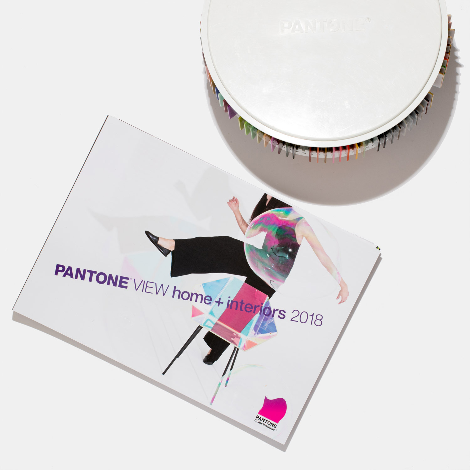
This book is paired with 75 forecasted Pantone cotton standards for soft home applications.

PANTONEVIEW home + interiors 2018 offers inspiration, key color direction and suggested color harmonies targeted towards interior design and home furnishings, including housewares, decorative accessories, bedding, bath, toys, ooring, indoor and outdoor furniture, paint, oral and food design.


Looking at color as the catalyst that can de ne the space and create the magic and the mood, PANTONEVIEW home + interiors is segmented by color trend with each story broken out in the following way:

1) Introduction
Each palette is introduced with a written overview of the trend and a supporting visual that sets the tone and highlights some of the key colors in the trend palette.

2) Inspiration Photos
Then follows four pages of photos which visually display the lifestyle concept or inspiration from which the trend story evolved and developed, as well as visuals of products and end-uses where the trend colors are applied. Color harmonies are displayed within these photos as are key palette descriptors.

3) Harmonies
Located within the photo pages is a printed color card of the trend palette along with the individual palette rationale, key color directives and color harmonies. Color harmonies show which colors should be mixed together and in what proportion or measure.

4) Summary Page
Highlighting additional insight and directions, a summary page concludes the forecast with a comprehensive color overview and a look at other factors in uencing the forecast.

5) 2018 Colors by Color Family
Printed color card displayed by color family provides a quick color overview.

6) 2018 Key Color Direction – NEW FEATURE
Written and visual overview highlighting key colors and concepts to take forward for product, interior design and visual merchandising.

Format

  • 12” x 18” oblong format; soft-cover, wire-bound book
  • 75 Forecasted Pantone cotton standards separated into palettes
  • Printed color card highlighting color direction by color family
  • Forecast imagery, separated by palette and color family, available via download
  • Includes PANTONE Color Manager Software

Color

  • Overarching forecast theme
  • Eight individual palettes supported by trend story, inspirational imagery, color harmonies and palette key words
  • Each trend palette contains four to five color harmony options
  • Topline look at key finishes, textures, and patterns
  • Printed color card displays forecast colors by family
  • Written and visual overview highlights key color concepts
  • CMYK values for each of the 75 forecasted colors

For those designing in plastic:

PANTONEVIEW home + interiors 2018/ Plastic Standards additionally includes large PANTONE Plastic Standards Chips of each of the 75 forecasted colors in a carousel organiser.

This PANTONEVIEW home + Interiors format comes with 75 forecasted plastic standards in a spinning carousel arranged by palette.

PANTONE® and other Pantone trademarks are the property of Pantone LLC. PANTONE Colors may not match PANTONE-identi ed standards. Consult current PANTONE Color Publications for accurate color. All trend information © Pantone - http://www.pantone.com

Tuesday, August 2, 2016

Violet Verbena Named 2017 Color of the Year by PPG PAINTS Brand

The PPG PAINTS™ Brand Unveiled Its 2017 Color of the Year: Violet Verbena (PPG1169-5), a Grayed-off, Moody Purple with a Chameleon-like Presence.

 Violet Verbena named 2017 Color of the Year by PPG PAINTS brand (Photo: PPG PAINTS)

"Violet Verbena is at once as nostalgic as it is modern. It’s substantial in a world that can sometimes seem so temporary, luxurious in a harsh world that needs pampering, and introspective and private in an invasive world," said Dee Schlotter, senior color marketing manager, PPG. "Purple was unanimously selected as the 2017 Color of the Year by PPG’s global color experts for its distinctive qualities. We are seeing this shade of violet on the runway in fashion, and in textiles for the commercial and residential segments."

Schlotter cited a new era of consumer mindsets as part of the reason that the PPG Paints brand selected Violet Verbena as the hottest color for 2017. These new attitudes defy convention and blend ideations of gender, relationships, careers, workplaces and living spaces, she said.

“Consumers now embrace the middle ground between masculine and feminine, young and old, and work and leisure. Violet Verbena’s blending of gray and violet reflects that middle ground,” Schlotter said.


Violet Verbena serves as an ideal evolution of the bohemian, gypset (gypsy-jetset) consumer lifestyle that has been trending recently. As this type of consumer shifts in to new attitudes and experiences - they are becoming more mindful, more mystic, and more deeply involved in spiritual exploration and fascinated with cosmic exploration, she said. “Consumers are drawn to the galactic dark colors that combine deep purples, blues and grays to create an intriguing futuristic vibe,” Schlotter said.


PPG’s more than 20 color stylists around the world, each specializing in different markets, collaborate to determine styles and color trends for homes as well as electronic devices and automobiles. The company’s unique position as a color leader in multiple industries enables it to observe and translate emerging global color trends for its customers’ applications – from consumer goods to automotive, from residential to commercial to industrial design.

The PPG Paints brand’s 2017 Color of the Year is a unique violet hue with a quality that allows it to adapt to surrounding environments and complement a variety of design aesthetics. When paired with dark neutrals, the color unveils gray undertones, but when paired with whites, it reads as a purer purple, according to Schlotter. Its design appeal is similarly nuanced, she said. “Violet Verbena blends perfectly with many different surroundings, like a chameleon. It looks polished yet playful in a child’s room, and it is calming enough to be used in hospitals or other spaces that require tranquility.

"The color is a modern choice for interiors and furnishings, yet it is elegant enough to be incorporated into traditional designs,” she continued. "Violet Verbena is colorful enough to make a statement, but it can also be considered neutral with its gray undertones."

Violet Verbena is the focal point of PPG’s four global color trend stories for 2017, which center on the theme of Pendulum: earth, water, fire and air. For the first time, the PPG Paints brand includes its Color of the Year in all of its trend themes, as the prevalence of this hue allows it to live in every story. 


The four themes are:

HOURGLASS: A classic palette with a contemporary spin, this theme represents the earth element, with consumers finding stability in what they know and gravitating toward designs rooted in historical relevance. The palette incorporates rich, royal hues such as PPG Paints brand colors Burgundy Wine (PPG1053-7), Old Mill Blue (PPG1171-6) and Castle Stone (PPG1128-7), blended with a healthy dose of neutrals such as Pearl (PPG1087-2) and Go To Gray (PPG1004-1), to pair beautifully with wood, marble and stone tile. The lavender hues of Violet Verbena add to the royal nature of these colors, while still blending effortlessly with greens, blues and neutrals.

ES/SENCE:
This theme focuses on the element of water, purity and the premise that less is unequivocally more. In a time when many consumers are embracing minimalism, the colors in this palette evoke a sense of simplicity and relaxation. Watery blues, lush greens and soft blended tones provide a mellow, calming and refreshing mentality. Sea Mist (PPG1227-1), Ancestral (PPG1047-4), Almond Cream (1086-3) and Simply Elegant (PPG1155-3), a few of the colors in the palette, create a soft, calming ambiance and pair beautifully with soothing Violet Verbena.

IMPOWER: Centered on change powered by the fire element, this complex palette incorporates deep tones, light neutrals and everything in between. It celebrates the fact that consumers do not have to define themselves by any specific design personality, but can exist somewhere in between. Consumers drawn to this palette can pair furnishings and colors from various genres and disciplines in a decadent yet easy fusion. Bold colors of the PPG Paints brand such as Azure Tide (PPG1231-6), Cenote (PPG17-02), Red Licorice (PPG1186-7) and Crushed Pineapple (PPG1213-7) pair with muted neutral tones such as Willow Tree (PPG1112-6), Gray Violet (PPG1014-5), Silver Screen (PPG1014-3) and not-quite gray Violet Verbena.

BIOCENTRIC: This design story is representative of air and the idea that we are all connected, and the palette dazzles with space-inspired hues and saturated organics. PPG Paints brand colors Spinach Salad (PPG11-16), Blueberry Muffin (PPG1164-5) and Enchanting Eggplant (PPG13-07) give the palette an organic vibe, while Black Flame (PPG1043-7), Cavalry (PPG1041-7) and Witchcraft (PPG1037-7) offer blue-black mystery to the palette and pair beautifully with Violet Verbena. Incorporating these colors into the home gives the look of contemporary elegance and laid-back charm.


Violet Verbena and all the colors of the 2017 Pendulum color trend stories, along with 2,000 colors in PPG's palette for THE VOICE OF COLOR® system, are available at PPG Paints stores and independent retailers across the United States in the PPG Paints, PPG PORTER PAINTS® and PPG PITTSBURGH PAINTS® product lines.

To learn more about the PPG Paints brand or to find a store near you, visit www.ppgpaints.com


PPG's architectural coatings business in the U.S. and Canada is an industry leader in residential and commercial coatings, delivering the latest technologies and operational advancements through its strong portfolio of brands. It manufactures and sells interior and exterior paints, stains, caulks, repair products, adhesives and sealants for homeowners and professionals. Its distribution network includes more than 15,000 touchpoints through company-owned stores, independent dealer locations and all major home improvement centers across the U.S. and Canada. For more information, visit PPGAC.com.


At PPG, we work every day to develop and deliver the paints, coatings and materials that our customers have trusted for more than 130 years. Through dedication and creativity, we solve our customers’ biggest challenges, collaborating closely to find the right path forward. With headquarters in Pittsburgh, we operate and innovate in more than 70 countries and reported net sales of $15.3 billion in 2015. We serve customers in construction, consumer products, industrial and transportation markets and aftermarkets. To learn more, visit www.ppg.com.


All images courtesy of PPG PAINTS. 

PPG Paints and We protect and beautify the world are trademarks and the PPG Logo is a registered trademark of PPG Industries Ohio, Inc.

PPG Pittsburgh Paints, PPG Porter Paints and The Voice of Color are registered trademarks of PPG Architectural Finishes, Inc.